
I’m not a graphic designer by any stretch of the word. But, like filmmaking, I have a basic understanding of it (and I do mean basic as in I took one media arts course in high school and that told me enough about how hard the filmmaking world is) so when I see people who turn out spectacular graphic design work, all I can do is say, “Wow.” Because as someone who’s played around on Photoshop to know how tough it is to remember to switch between layers, I know how hard they’ve worked to produce their art.
This is not that.
Just roll with me on this. If someone was to take the groundwork I’ve laid here and pump in some quality work, then, by all means. Please. I think this deserves it. Maybe when I have more time than the hour and thirty given to me during the boys’ nap time, I will, but for now, this is all I can do. Forgive me.
Book covers are the eye-grabbers, the things meant to draw in people who may not know what the book is. It’s for the casual reader, something enticing that makes them ask themselves, “Ooh, what’s this all about?” This comes from my own knowledge of being a former child of the 90s who wouldn’t read anything unless there was a promise of gore, violence, or something radical on the inside.
But to go even deeper than that, I wanted to dissect the covers of the Goosebumps series to see if there was a trend or pattern to them, similar to what Penguin publishing did with the Marber Grid in the 60s. Remember, excuse my lack of proper graphic design technique, but here’s what I found…
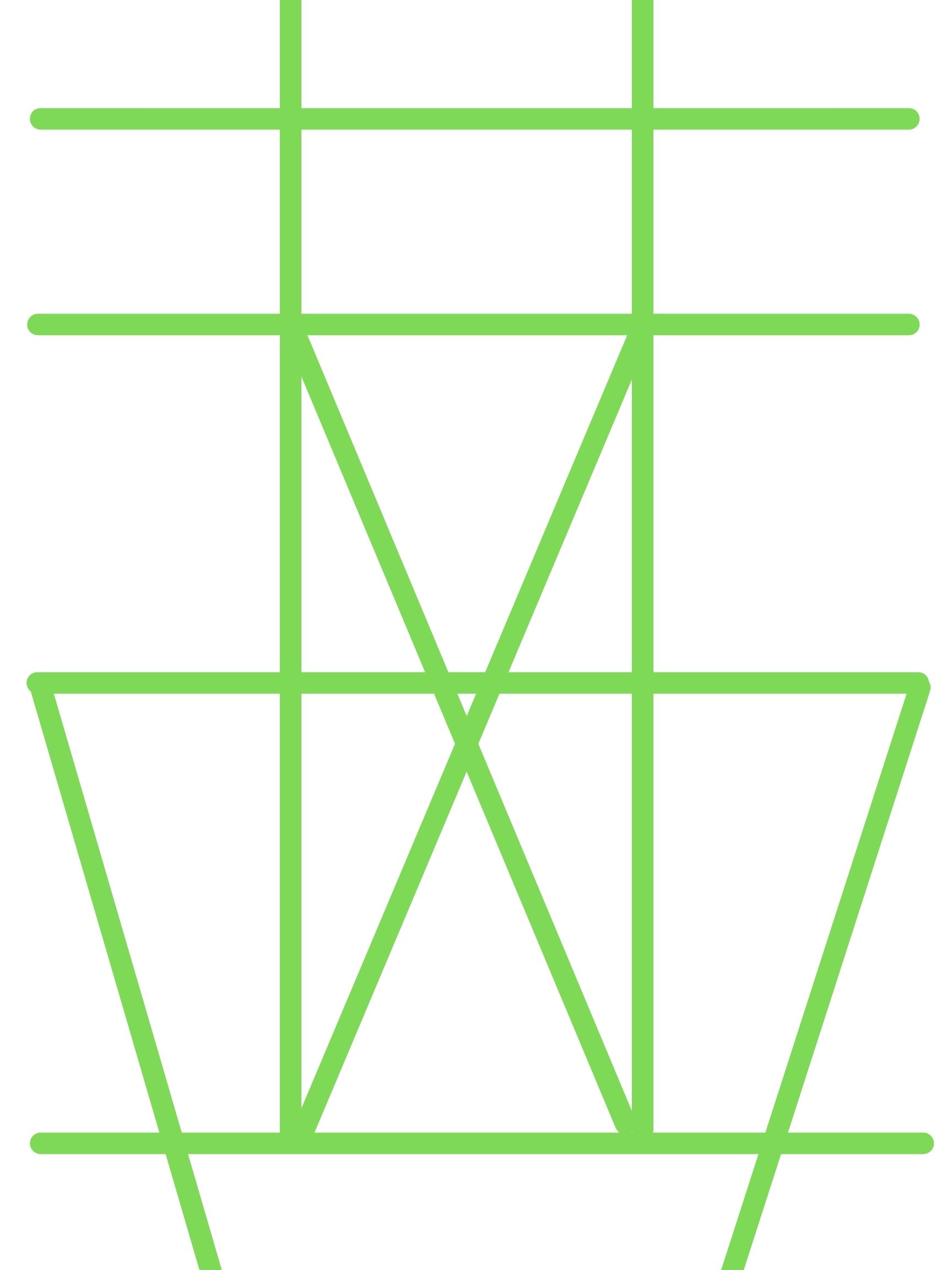
This may not mean much, but there’s a pattern to these covers, one that might have been luring us in for a long, long time.
Like, all of elementary school.
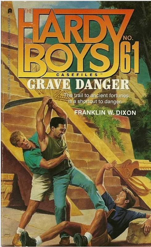
Not all of the following covers were the same size. Some clocked in at 2283×3248 pixels while another was 2061×2952 pixels, but I did my best to fit them to the frame so, roughly, you’ll see some overlap. (IMPORTANT: Each of these was found thanks u/neilcic and their collection over here.)
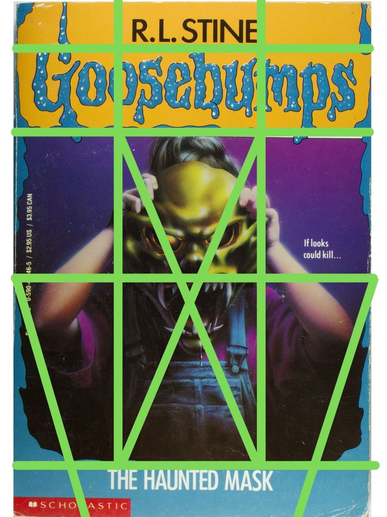
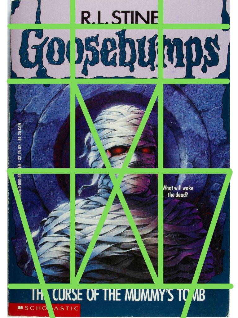
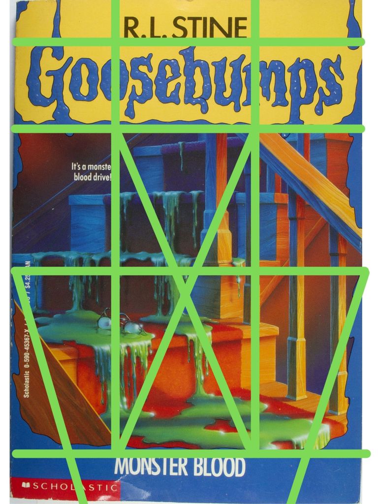
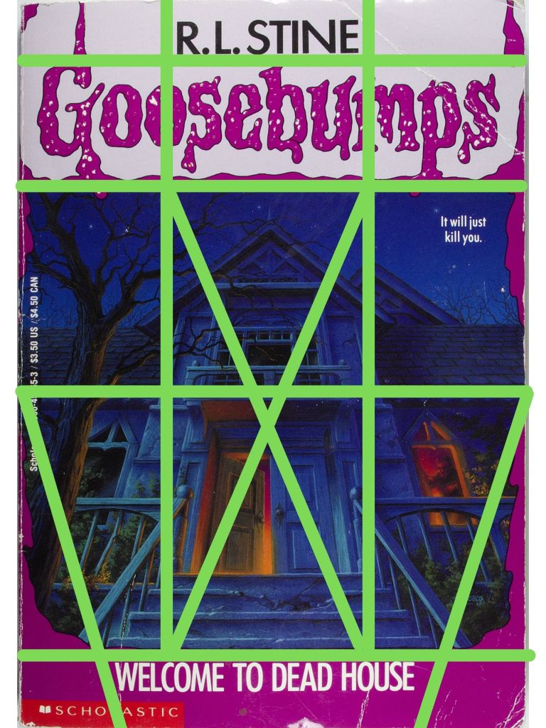
What should I call this? The Jacobus Grid seems fitting, as cover artist Tim Jacobus developed each of these in his original run on the Goosebumps series.
There’s definitely a flow here, something that draws the eyes downward into the canyon of terror. The crossing X pattern is where the most disturbing thing usually lies. A graphic tease as to what’s inside. Even when it’s something as innocuous as slime on steps the X is showing you where the danger is. The V shape along the side boosts the horror, supplementing the already frightening image in the middle, ensuring no gross-minded 90s kid could ever turn away. It’s the rails of haunted steps, leading into a decrepit house, or a girl’s arms putting on a possessed mask, representing how this child could easily be YOU.
The title mostly fit into the bottom of the V-shape at the bottom, with a few exceptions for longer titles. The little captions, the ones that always made the book seem like some kid was about to die, always hide in one of the four rectangles on the edges. The “R.L. Stine” at the top is aligned with the title, when it does fit at the bottom.
It’s certainly something. Rough, obviously, not a graphic artist, but there’s something.
Maybe worth checking against other modern kids’ series books, post 1995?
Thanks for reading,
Follow me:
Twitter: @robacosta
Instagram: @robacosta
Contact: robertmichaelacosta@gmail.com


Leave a comment